
Are you starting your own business and thinking about creating a unique brand or are planning a rebranding? Preparing a clear and consistent communication can be quite frustrating and overwhelming mainly when you have the wrong guidelines and are not used to design terms.
I want to share with you a new way of looking at the 5 main elements of a powerful branding that can help you build a strong online presence for your business.

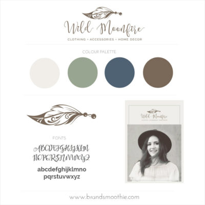
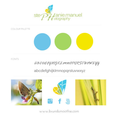
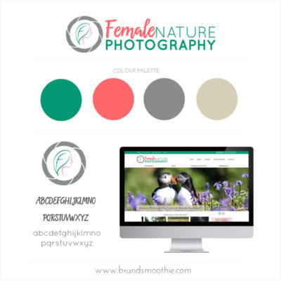
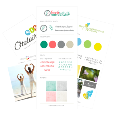
1. LOGO CONCEPT
Your logo is like a shiny badge during an international event. If you just walk in and start to talk to each and every people in there, you might get tired of explaining to each and every person who are, what you do and how your work style is unique.
What a relief it would be to simply indicate your badge or get noticed because your badge appeals to like-minded people. Your logo is a unique element that opens up the conversation and provides important visual information in a quicker way.
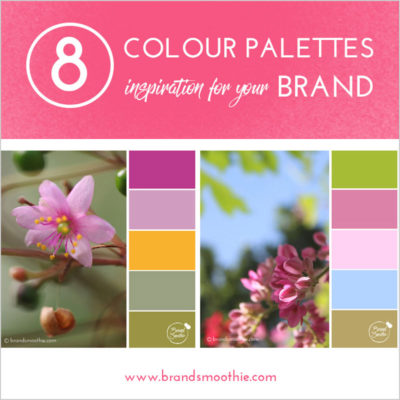
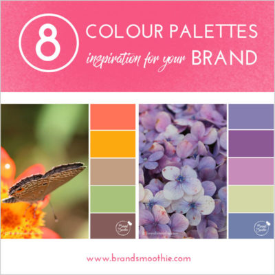
2. COLOURS
Why do you think people are so amazed when they are in a tropical forest, happily looking at lush trees and gorgeous flowers? Picture it for a second. How do you feel? This is one of the power of colour communication and nature is one of the main source of inspiration. We are attracted by colours as they evoke a feeling.
A blue sky inspires freedom, a pink flower speaks passion and a green leaf invites us to relax. Choosing the right colours for your branding is all about creating the right experience and environment for you and your audience.
3. FONTS
Writing is really an intentional way of communicating. For a quick side note, for our own use, the handwriting might not be clear for everyone to read as we do know why we wrote that down. If we are writing a gift card to share our happy wishes, we’ll take our time to form the letters in an elegant way so as to share a lovely message to someone else.
So choosing the right fonts for your brand is all about showing how you want to communicate as clearly as possible.
4. GRAPHICS & PATTERNS
“Draw me a sheep” asked the Little Prince and yet the first drawings didn’t match what he was looking for. Before we get to speak with words, we do visualise the shapes of the things that we want to communicate about. That’s the role of graphics and patterns in the branding process. They are like call to action buttons with their specific purpose. A arrow to show a direction, a circle to help focus an attention on a point or a lightbulb to represent an idea.
5. PHOTOGRAPHY STYLE
Will my nature photography representing sandy beaches, seashells and lush tropical leaves correspond to your way of communicating about YOUR business? They might be lovely inspiration during your busy working days so as to relax but they will not speak to your target audience about who you are and what you do.
Using pictures that match your brand is the most effective way of telling the story of your business as it helps you create a visual experience for your potential client. You are able to show how great it is to work with you can and this is one of the most powerful communication tools to grow your online presence.
Rebecca
Stephanie is so lovely and has a wealth of knowledge in her expertise, this comes across very clearly. Thank you for the session, I’ve made a lot of changes to my website with your advice & still more to go. It was clear, your advice was easy to follow & I was able to take action immediately after our discussions. Highly recommend 🙂
Jacqui
Freaking AMAZING little bit of info!! Thanks 💋